Chart Types
Scatter Chart
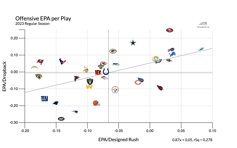
A scatter chart shows the relationship between two stats.
Histogram
Hover over a bar to see the teams and stats represented in that bucket and their exact values.
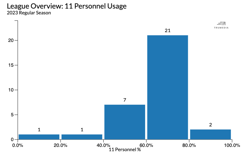
A histogram shows the frequency distribution of a stat.
Time Series Chart
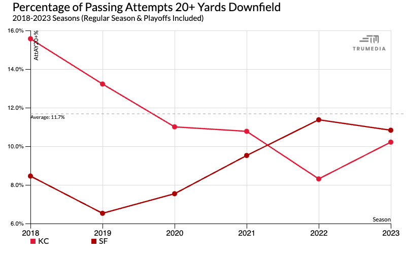
A time series chart shows trends in the data over time.
Swarm Chart
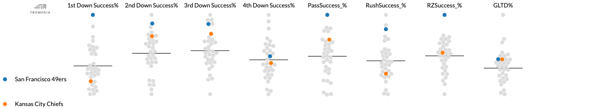
Each point on the chart represents a team’s performance in that metric and the black line in the middle displays the league average.
Bar Chart
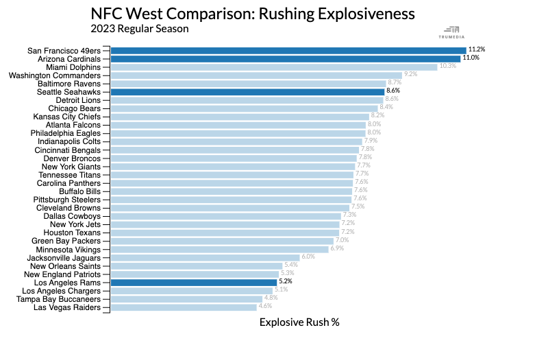
A bar chart is used to compare performance for one stat; the size of the bar on the chart corresponds to the number value.
Stacked Bar Chart
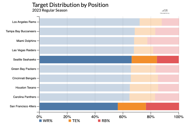
A stacked bar chart visualizes more than one stat on a single chart.